Web redesign
Client: Craigslist (Speculative)
UX Design & Web Design
Play around with the desktop prototype and the mobile prototype here.
Craigslist’s website design is a nostalgic nod to the early internet era, embracing a simple, text-focused layout with minimal distractions. Its classic blue hyperlinks, straightforward structure, and no-frills approach make it incredibly fast and easy to navigate. While it may feel vintage compared to modern sites, its efficiency and familiarity have stood the test of time, making it a unique and enduring online space.
I believe that a thoughtful redesign could enhance the user experience while honoring Craigslist’s retro charm, creating a perfect balance between modern usability and nostalgic simplicity—ensuring it remains both functional and true to its iconic identity.
USABILITY TESTING:
Before I began the redesign, it was important for me to understand the way users interacted with the website. Having easy access to avid web users, I decided that the best way of learning user behaviour was through usability testing of the following pages:
Home page
Listings page
Product page
After several rounds of testing, and synthesizing the data I followed the following steps to determined the context around the redesign.
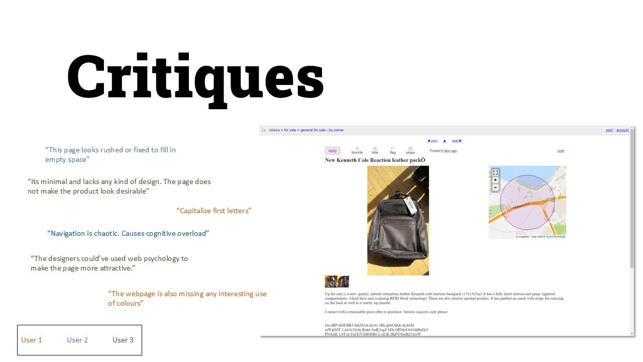
Synthesized data and using affinity mapping, discovered the main critiques from users.
Used the Critiques to develop insights into user’s experience of the current state.
Based on the insights, I created a design brief for myself.


For the typography, I chose a font that looked modern but still maintained the old-time look of Times New Roman. Roboto Slab works best for this since it not only does that but also adds a laid-back casualness to the design that I feel characterizes craigslist as a website.
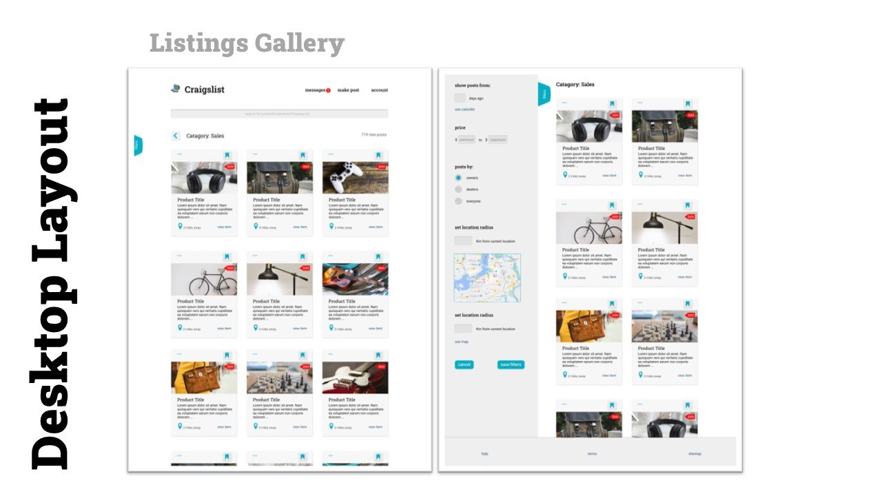
I was mindful of incorporating a simple z-pattern layout while designing the website. Here the eye flows across the web page from left to right, and top to bottom. This made the website more predictable and calming to use.
Moreover, the proximity between elements was a major cause of heartache within users, so I was very deliberate with creating well spaced out layouts
for the item gallery section of the website. The combined with the sparse and punctuating use of red draws the eyes immediately towards the products listed on the pages.
A significant aspect of this redesign attempt was to incorporate accessibility to the website, which is severely lacking in the current iteration of the website. The colors used have been marked as AAA on Webaim, and the buttons are designed to be large (sometimes oversized) to do my best to adhere to the WCAG guidelines for accessible web design.
With these design changes, I believe that my redesign not only makes craigslist more accessible, but also more engaging and less confusing to use.
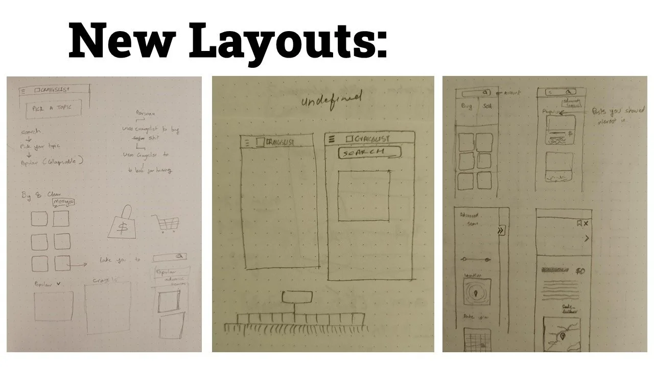
My approach to the redesign was to tackle the issue that the users pointed out the most. i.e. the severe cognitive load born from the chaotic, and unorganized layout of the website. The website offers a lot, therefore, it was important for me to understand the services and create an information hierarchy that made sense for it. To do this, I decided to borrow the same information architecture from the mobile version of the website.
This immediately reduced cognitive load made the website more organized on both mobile and website.
The second issue that I wanted to tackle was the drastic inconsistencies in design and design language not only between the desktop and mobile but within the different webpages within the website.
This was quickly solved by spending time creating a standard design language and system to unify all the aspects of the website. The use of sticking to the classic colors of Craigslist, blue and gray seemed the ideal choice. I chose the existing colour scheme because it was already high contrast. I did, however, adjusted it to look more modern and timely, while still retaining its bare-bones roots.
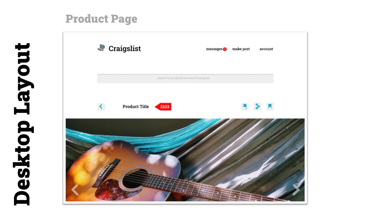
I was careful however to make sure that the retro look and feel of the redesign does not interfere with the usability of the website. Therefore, important pages such as the product page are much more direct and drop any distracting design elements.

VALIDATION & ITERATION
From the feedback, I believe that the re-design achieves the goal that we set out to achieve.
The main feedback insights we gained from the original round of reviews was the website was hard to navigate due to chaotic organization, unappealing design, and a severe disregard for negative space.
The overall feedback highlight’s that the users appreciated the new information hierarchy, by calling the website more organised and by noting that the website now ‘flows well’ and important elements seem “well-aligned”.
The fact that all the important elements have been spaced out has also become a cause for positive feedback from the users. Phrases like “breathing room” and “space to rest my eyes” has been employed to describe the new layout.
But overall, people seem happy with the redesign and seem to enjoy the legacy look of craigslist being modernized.
However, a few new challenges have also been highlighted within the user’s experience in their feedback. For example, user 2 would like the buttons to be smaller, while user 3 considers the negative space in the filters to be too much.