
Logo Design Process
A well-crafted logo serves as the visual cornerstone of a brand, embodying its core values and making a lasting impression. As I embark on the journey of creating my logo, I want it to be a perfect representation of reliability, sturdiness, and passion, while also embracing a sense of fun, playfulness, and creativity. Striking a balance between professionalism and excitement is crucial to engaging and inspiring curiosity in my audience.
The logo should reflect themes of education, science, and research—fields that thrive on knowledge, innovation, and discovery. At the same time, it should not feel overly rigid or corporate. Instead, it must be approachable, energetic, and stimulating, appealing to both experts and enthusiasts who share a love for learning.
This blend of stability and liveliness ensures that the logo resonates with a wide range of people, from serious academics to young, eager minds exploring science for the first time.
As I refine my thumbnail sketches, I will focus on harmonizing these visual elements into a single, cohesive identity. Once I identify the strongest concepts, I will move toward digital iterations, experimenting with colors, typography, and final refinements to ensure the logo fully embodies my vision.


5 Shortlisted
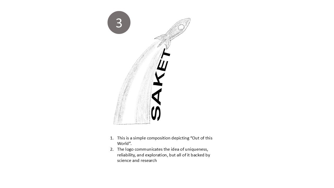
After the 10 logo thumbnail explorations, I shortlisted 5 of the logos that I would share with users and peers for review and feedback


Feedback
After the 10 logo thumbnail explorations, I shortlisted 5 of the logos that I would share with users and peers for review and feedback


Finished Options
Based on the feedback received, I shortlist the final two logo options. These two options will then be digitally prototyped as vector files on Adobe Illustrator.


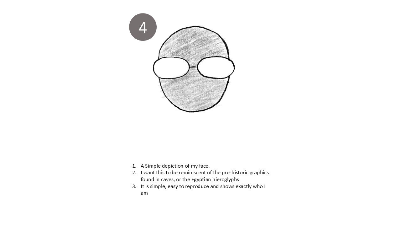
Final Logo and Branding
I chose the final logo to be the silhouette of my face in black and white, for its simplicity, the caricatured quality of the face also highlights the fun-loving aspect of my self.
Having selected my logo, I pair it with accent colours and typography.